Portland Thorns Reveal New 2024 Kits - STF Reacts
The Portland Thorns showed off their new kits to mixed reactions...
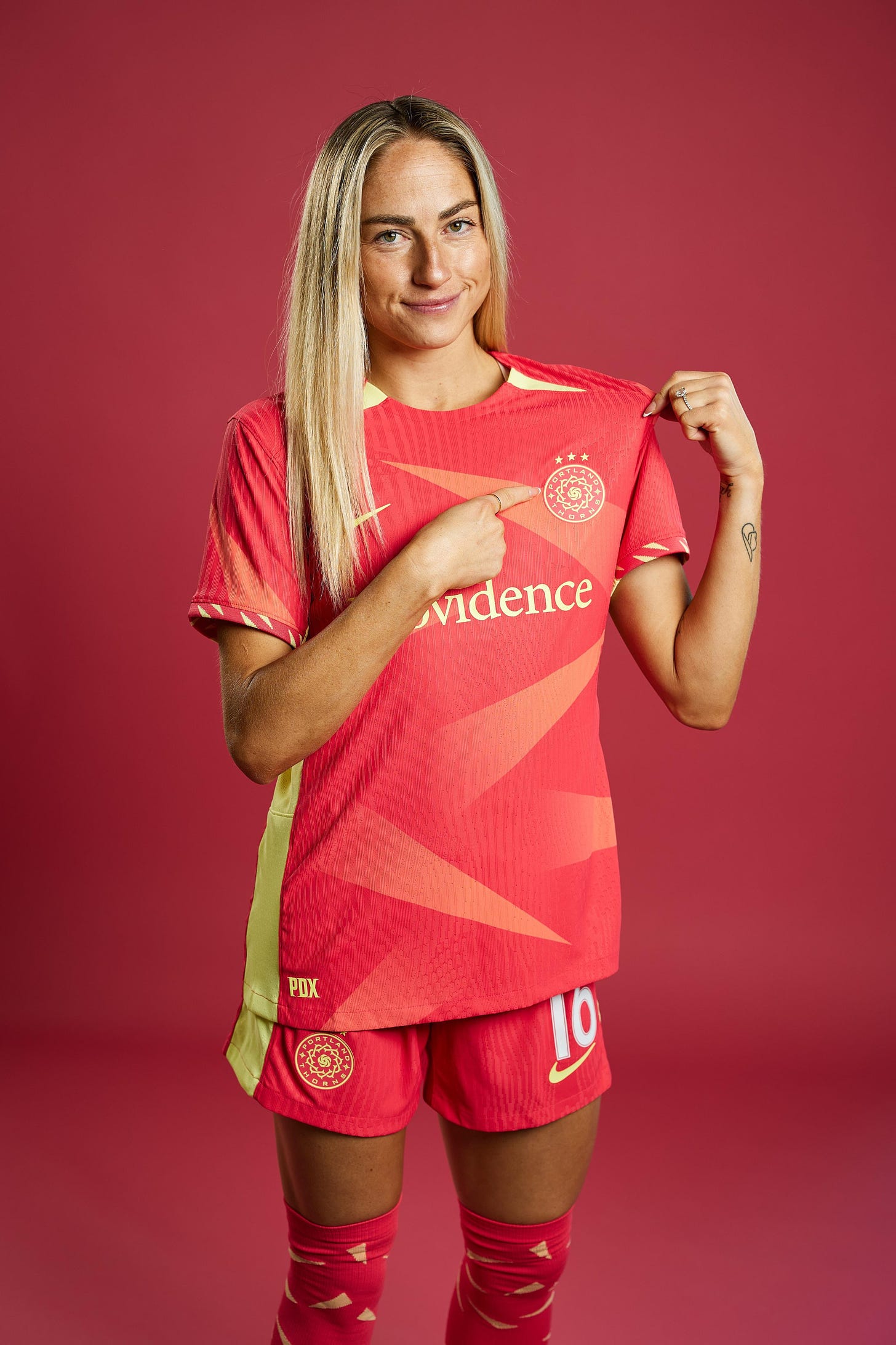
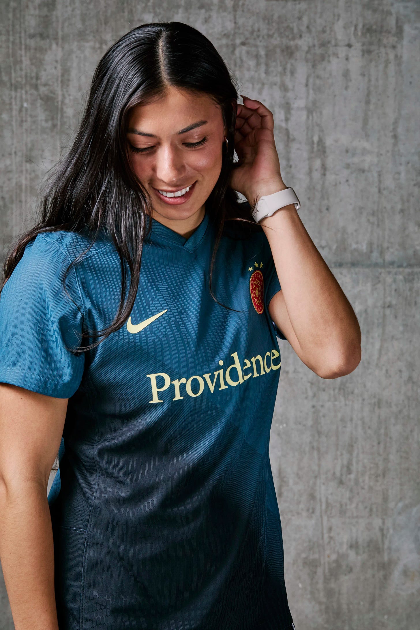
The Portland Thorns unveiled their new jerseys for the 2024 NWSL season today: the “Forever Thorn” and “Reflection” kits. As seems to always be the case with Thorns jerseys, they have drawn out the takes.
You can read the team’s press release and view more photos of the jerseys here.
And you can read on to see the Stumptown Footy team’s reactions and thoughts to the kits below:
Forever Thorn Kit (Primary)
From the Thorns release about the creative process: “Our Forever Thorn kit, designed by Nike, is an expression of the joy of matchday in PDX, and that unique bond between club and community. The bold-colored thorns embedded in the jersey move in an upward trajectory, symbolic of our pursuit to raise the bar as a club, for the league and the women’s game.”
Alex: Forever kit might be my favorite Thorns kit of all time. The red and gold accents on the sleeves, socks, and crest/stars looks amazing to me.
Grade: 9/10
Phuoc: This is definitely my favorite kit out of the two, but not sure that says too much. I do like that it is very bright and colorful, but this shade of red doesn’t feel like Portland Thorns FC to me. I don’t think Nike went for it with either one of these kits, but this one definitely will grow on me in the future.
Grade: 7/10
Wilder: Honestly they’re fine, I like the red but it feels likes it’s missing something. The sleeve details are cool but in not a big fan of the red/yellow color combos.
Grade: 7/10
Sam: I've gone back and forth on the kits. I do like that we're back to red as the primary, and the gold accents on both jerseys really help them pop. A cohesive look is never a bad thing, and I think these will look good on the field. But the red is very… tomato-y to me.
Grade: 6.5/10
Melina: I only like the three stars
Grade: 5/10
Reflection Kit (Secondary)
From the Thorns release about the creative process: “The connection between our fans, the club, and our city – it’s bigger than soccer. It is a symbiotic relationship rooted in civic pride, passion, and authenticity. Embodied by our secondary jersey, we are a reflection of our community, the Rose City – a city of leaders, creators, winners, change makers, pioneers, and innovators. Introducing our Reflection kit.”
Melina: I only like the three stars.
Grade: 3/10
Phuoc: This does not feel like authentically Portland or community feel to this kit at all. It feels super lazy by Nike and truly think they’ve gone backwards since the 2020 kit that is an all time great. Neither kit will be remembered in years.
Grade: 4/10
Sam: It just feels kind of... safe. There's something missing from them, like something to really make them distinct and unique. These aren't going to illicit strong reactions from anyone like last year's tattoo kit, but I don't think they'll be flying off the shelves like the black roses from a few years ago.
Grade: 6.5/10
Wilder: The black one is nice, I like to gradient. Blue to black is a very different vibe with the other kit being warm tones but overall it’s classy.
Grade: 7/10
Alex: The reflection kit I’m less of a fan of, but still like the simple design aspect.
Grade: 7/10
Portland Thorns FC Statement on the creative process behind the jerseys:
Sports is a unifier – a place and platform for those to come together around a common cause. It joins those from differing backgrounds, ethnicities, viewpoints, ages, and life experiences to crystallize bonds and forge relationships.
And there is no experience like attending a Thorns FC match – the singing, the energy, the passion, the creativity, and the synergy between those in the stands and the best players in the world on the field at Providence Park.
That connection and the passion have inspired our 2024 Forever Thorn and Reflection kits.
Final Thoughts
Obviously, every kit will have supporters who love it and hate it. There are those who are not leaning one way or another. Each kit takes a year to two years to develop. We will not see a Lisa Bhathal Merage or Alex Bhathal influenced kit probably until 2026.
You can see the wide ranges in responses from us at Stumptown Footy and this is the best part to discuss our opinions with each other. We all have a bunch of fun sharing our thoughts and hope you all do too below in the comments.
I Miss You
This will always go down as my favorite NWSL kit of all time which is saying a lot when Orlando and Chicago consistently release sick kits most years.
When this 🔥 kit came out, I knew it would be the 🐐.
Anyone else miss this as much as me?


A friend pointed out that the Forever kit looks like a bag of Doritos and now I can't unsee it.
After VPN-ing the recording of the Denmark-Austria game this evening, I think I've watched or rewatched 10-12 Obaze games since she signed so I feel alright about making some some broad observations:
1. Girl's cool as a cucumber. Rarely flustered, and --the thing that stands out most, sometimes to a fault-- is that she REALLY doesn't like to make clearances to nobody. She'll scan and scan until she sees something she likes and usually makes the right pass, but she'll occasionally play a ball into pressure because she doesn't want to boot the ball up field or out of play.
2. Her style of defending is very positional in that she reads angles well and is rarely caught in the wrong space. She'll make tackles, has some size, and doesn't shy away from contact; but I wouldn't call her game overly physical. Not a lot of crunching tackles or booming headers in her game tape.
3. Isn't a speed demon necessarily, but definitely has athleticism and covers ground very easily. You'll see her run into frame and clean up overhit balls quite a lot.
Anyhow, we have literally no idea what the Thorns' plans are for her, but I think the ceiling of the team goes up if she's good enough to get some starts. I can't imagine we'll see a lot of her early on because we have two VERY experienced (if flawed) CBs, but I hope she shows enough that she eventually breaks into the team.